Grantit
Client: Grantit
Branding / Marketing Strategy
Grantit is a fin-tech company based in Hong Kong, which offers digital personal loans within 24 hours and financial solutions. Everything is digital with Grantit. It doesn’t require a physical presence to file a loan application or sign an abundance of paperwork.
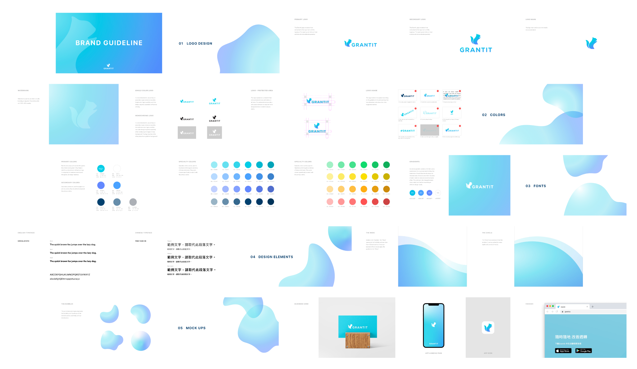
I worked directly with the founders to create a new brand identity that reflects its technological advancement and the brand’s vision. Chipmunk symbolizes restlessness, speed, harmony, and friendliness, which is what Grantit is. In the new brand identity system, I preserved the same representation of the chipmunk but presented it in a simple and modern style. The result is a refreshed design system that communicates trustworthiness, smartness, and liveliness.
Deliverables
Brand Positioning
Brand Story
Brand Identity
Color Palette
Brand Typography
Design Elements
Brand Guidelines
Brand Challenges
The original brand identity was not unique.
The original brand design was not up to date
The original branding did not reflect the company’s values and mission. Grantit wants to be known as a fin-tech company instead of a traditional money lender.
New Brand Identity
Color Scheme
Personal finance is a stressful topic, especially for young audiences, since it is not a common subject to be taught in school. The gradient and color scheme are carefully chosen to convey the hassle-free, seamless process and the long-term support that Grantit provides—to lead the customers to live a financially stress-free life.
The Bubbles
The success of the identity does not come from the logo alone. The Bubbles are the hero graphic elements of the new design system. This set of abstract shapes represent the flexibility and friendliness of the brand. This once again circled back to the brand mission: to help the customers “live the way you like it”, emphasizing the financially stress-free life that Grantit can provide. The flexibility of the shapes can easily be applied across multiple brand touchpoints.


